Sunday, January 2, 2011

Dear Friends.......


This couple chose to use the Boston skyline for the top of their seating chart, and the Bride worked with me to put together the chart to feature years that were special to the couple.
I did a timeline at the top of the chart so people could see the significant event from that year, and then there was a small illustration of the same next to the table numbers where people would be sitting. The table signs featured the year and the Boston skyline. This was different from anything I have done, but it was fun! The timeline is done with a dipping pen and I just got some awesome new gold ink that perfectly fit this bride's wedding colors! Congratulations and Best wishes Claire and Eddy!

Sunday, August 8, 2010

More of Katie and Brock's Wedding artwork!


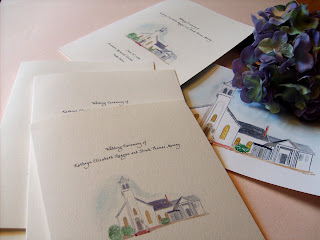
Katie and Brock are standing in front of the church where they were married...and below see the program Katie designed with El with the church painted on the front and details about how the bride and groom met the wedding party on the inside.


Even though Katie used a seating chart for all the guests, there were place cards at the head table for the wedding party, featuring her favorite compass rose.


Tables were adorned with hydrangeas and signs featuring the island name and pine tree island (of course) for the Casco Bay islands. Favor bags featured El's Cards tags with hydrangeas.


I loved every minute of all these projects! Congratulations Katie and Brock!

Monday, June 28, 2010

Katie and Brock's seating chart...nautical theme

After being able to create all the pieces for Katie and Brock's island wedding off the coast of Portland, Maine...this seating chart was my very favorite of all! Did I mention that I could do these all day long??! They are so much fun to create. The happy couple named their tables after islands in Casco Bay, so I made each table look like an island in Maine. On the Peaks Island table, there were all the elements of the invitations and other pieces included...the church (featured in watercolor on the programs), the reception site (from the invitations), the ferry (from the invitations), pine trees (from the table signs) and Katie's flowers, the hydrangeas (featured on the favor gift tags). This photo was sent to me by some wedding guests who loved it! And Congratulations and Best Wishes to Katie and Brock who are now on their honeymoon!

Wednesday, June 23, 2010

New Castle Fair

Hi Friends! This is the latest map from El's Cards...New Castle, New Hampshire. This Saturday Bob and I will be in New Castle at the Congregational Church at 65 Main Street with this map and all kinds of fun and original (of course) designs! The fair is from 9-3 and we'd love to see you there. Many artisans will be displaying their artworks and I would SO appreciate your support. Have a great week and looking forward to seeing you!

Thursday, June 10, 2010

Sunflowers in Tuscany


These seating charts are so much fun!! Seriously...I could do these all day long. Well, this week I did! Last week I got a call from a couple in Pennsylvania who saw some of my seating charts on my website and wanted to have one created for their own wedding day this Saturday! Of course I said yes, especially after hearing the theme. Italy is one place I am dying to go, so there I went creating the artwork for Mary Beth and Mark's wedding reception! Each of the tables was named for a city in Italy where the couple traveled recently on a special pre-wedding honeymoon trip through Italy.

This photo shows the details on the bottom of the seating chart. They wanted to include sunflowers so I painted some on the bottom in the landscape and then larger ones at the top and in the lower corner. These seating charts are becoming my favorite thing to do!

Friday, May 28, 2010

Gift tags with new hydrangea bunches!


These gift tags are perfect for wedding favors. Katie and Brock have been sticking with the nautical theme, but Katie loved the hydrangea trio so I put that design on these tags for their wedding! Of course, I did a brand new hydrangea design for her. I'm on a roll with the hydrangeas lately! Love the flower and all the fun variations in blue with the watercolor.


Katie and Brock's nautical themed Wedding invitations!

Here they finally are!! The invitations that were inside the hand lettered schooner envelopes were created with a few pieces included! The invitation was lettered in navy blue ink and has a rope design at the top and bottom to set the nautical mood. The reply card has a compass rose created especially for the couple (and was used on their save the date card too!). This card is done in the old fashioned way...allowing space for the guest to write a little note of acceptance. This is such a fun way to do the reply card by the way! The notes we got back were GREAT! There is a card with a picture of the ferry that will take the guests from the mainland in Portland over to Peaks Island and reminding them to not miss the boat! And the reception card has a watercolor rendering of the Inn where the reception will be held. Each piece is done in navy blue calligraphy and the designs are all original. It's so much fun to do a wedding "soup to nuts" like I am doing for Katie and Brock! More pieces coming soon...